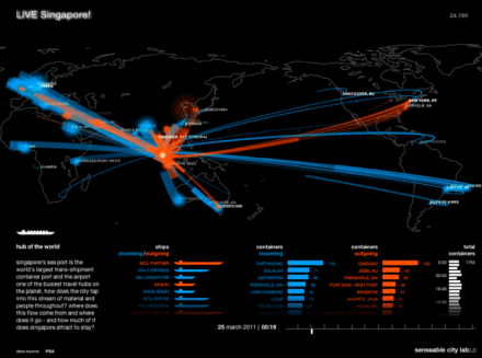
LIVE Singapore! provides people with access to a range of useful real-time information about their city by developing an open platform for the collection, elaboration and distribution of real-time data that reflect urban activity. Giving people visual and tangible access to real-time information about their city enables them to take their decisions more in sync with their environment, with what is actually happening around them.
Read more
The script writers must be bashing it out now: John Le Carre meets Internet. Hollywood man of choice for Assange? Johnny Depp? Irony: In a transparent world everything is fake.

Via fastcodesign.com
And the Guardian does it again: a map interface for browsing cables.

In our world, this is site is really good porn you wish you had made yourself. And Manuel Lima, founder of London’s VisualComplexity.com, is King of maps!!! Phrooooooawwwwwww!!

Breathing earth is a website that shows a visual real-time simulation of the carbon dioxide (CO2) emissions, birth rates, and death rates of every country in the world.

Like every complex network, Facebook offers unlimited possibilities of visual representation of the various connections between its users. Here are six data visualizations….ah beautiful!
“Age of the world” by Mathieu Lehanneur, will be showing at Issey Miyake in Paris, October 2009 for Fashion Week. Mathieu Lehanneur has created Age of the World containers, made of enameled ceramic at Vallauris by Claude Aiello. They represent population data of ten different countries, amongst them France, USA, Japan, Egypt and Russia, moulded in 3D ceramics, 60 cm high x 60 cm wide.
As he explains, he wanted statistics to quit charts and graphs to reincarnate in a curious set of containers, whether jars or urns, creating a radical representation of our human bondage in this world. Birth is the base and death the apex of these terra cotta pagodas, whose contours change in phase with the age rings that translate life expectancy. From bottom to top there are 100 strata, shaped in solid or void, but the top end is always a sharp tip. The goal is to create a fascinating twin-scope view of the state of living, a look at our own life-span in a sculptural surround view.
Thanks to Yatzer for the post.
Here is a free data visualization application for the iPhone by MeLLmo. You download datasets to the app and it creates visualizations so you can drill down into the data. The app is pitched as a mobile business tool for viewing sales reports and the like, but the sample visualizations included with the app suggest another possibility: RoamBi could easily be a killer app for statistics-minded sports fans, such as sabermetrics devotees- read the review here.