Seeing things differently
ALL DESIGN aims to take into account multiple perspectives. But how much do our design decisions create negative impacts and outcomes that we would, normally, horrify us – if we consciously designed them?
This is the challenge Design faces. Visualizing complexity is a design approach that has always been used to handle multi-layered facts and perspectives. By using creative methods to visualize dry data and diverse perspectives, people in an organization can make more informed decision-making, from the outset of a project.
Take the world map as we know it today. The Gerardus Mercator’s projection was first published in 1569, and became widespread because it depicts a line of constant bearing as a straight line, which was relevant at the time for marine navigation. But the drawback of using that map today, to visualize new and existing business markets, is that it distorts the shapes and relative sizes of all the countries. The map distorts our perception of the world and how we view people from various parts of the world.
The map of True Africa created by Kai Krause, shows that Africa is far larger than we think. Then see the maps on land area to population, or amount of money per head spent on healthcare, and we instantly gain a more informed picture on which to base our innovation strategies.
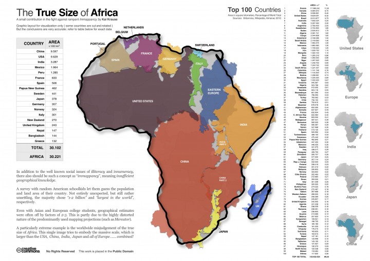
The True Africa map by Kai Krause shows the size of the continent in relation to European counties.

The Gerardus Mercator’s projection was made for marine navigation.
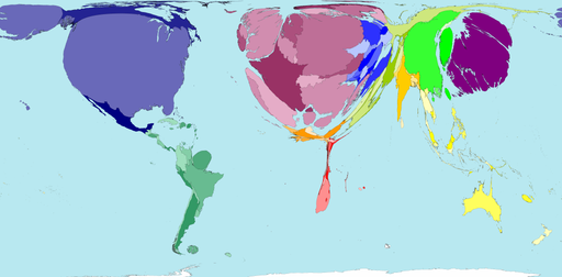
Map from worldmapper.org shows public health spending to population
Innovation is not so much of an outcome, as a process of asking the right questions at the right time, and asking them again and again, reiteratively.
Life is in real-time, across connected networks, complex beyond our imagination. Innovation means never being satisfied with the obvious assumptions. Innovation is not a destination.
Data visualization has yet to find its role in delivering real-time information for communications for ongoing critical decision making, for the protection of biodiversity, for climate change and for the protection of mankind.
Visual maps in themselves do not tell us what to do, but they can help us harness knowledge and creativity to solve critical issues and problems. No market research report or marketing message can compete with factual, real time information. We need to use technology and its designs to help us question all the assumptions that we take for granted- and make sure our good intentions result in meaningful and even destructive activities.